Southeastern Railway needed a clear and distinctive brand proposition that could connect better with customers and employees, and create a more unified experience across every touchpoint.
We positioned Southeastern as The More Human Line, with a mission to deliver its best-ever passenger experience. The identity was designed to cut through the fast-paced travel environment with simplicity, clarity and warmth.
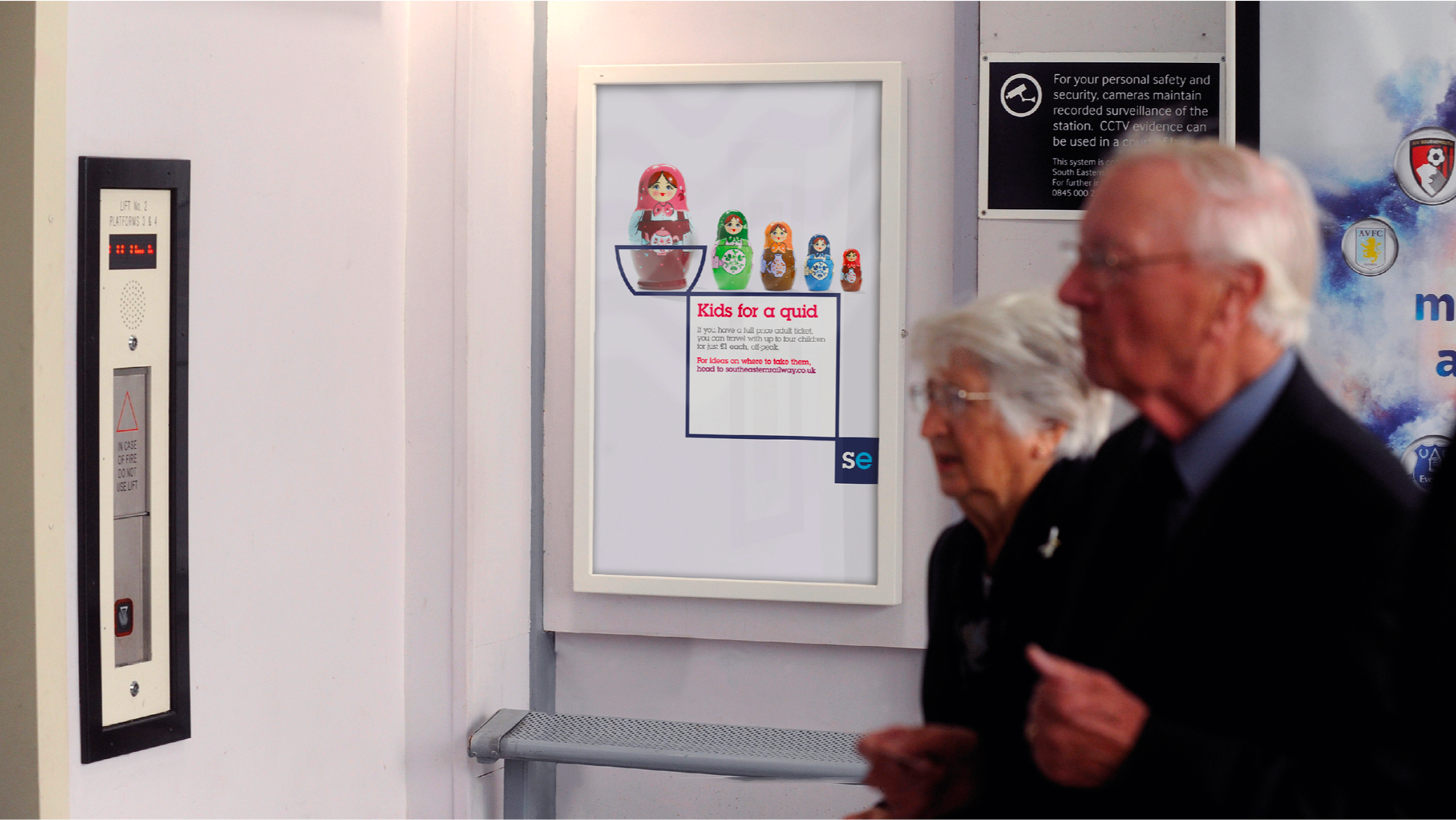
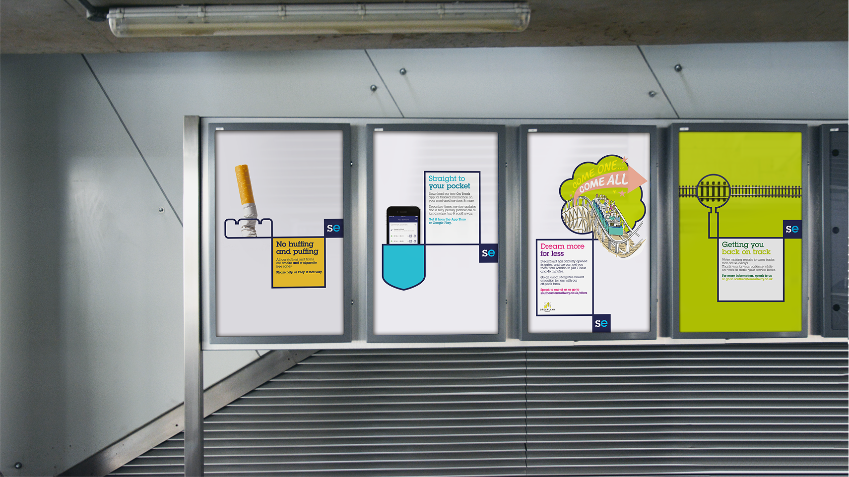
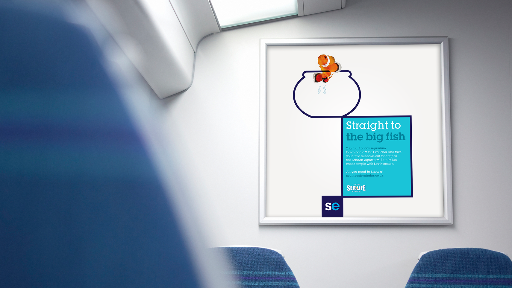
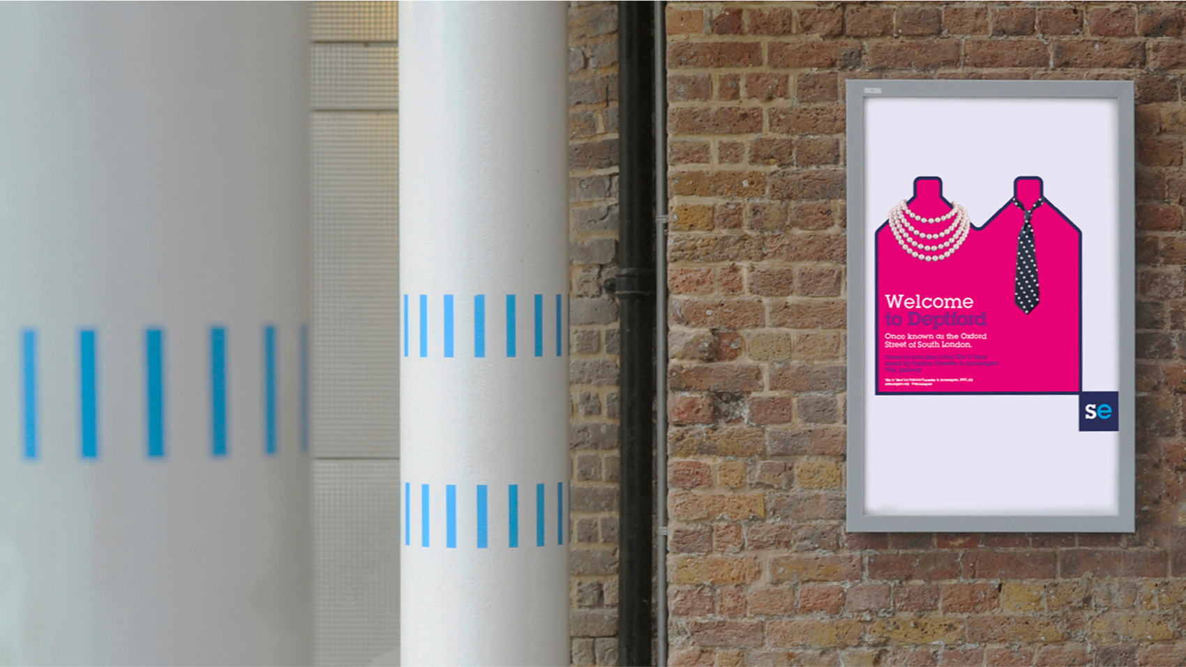
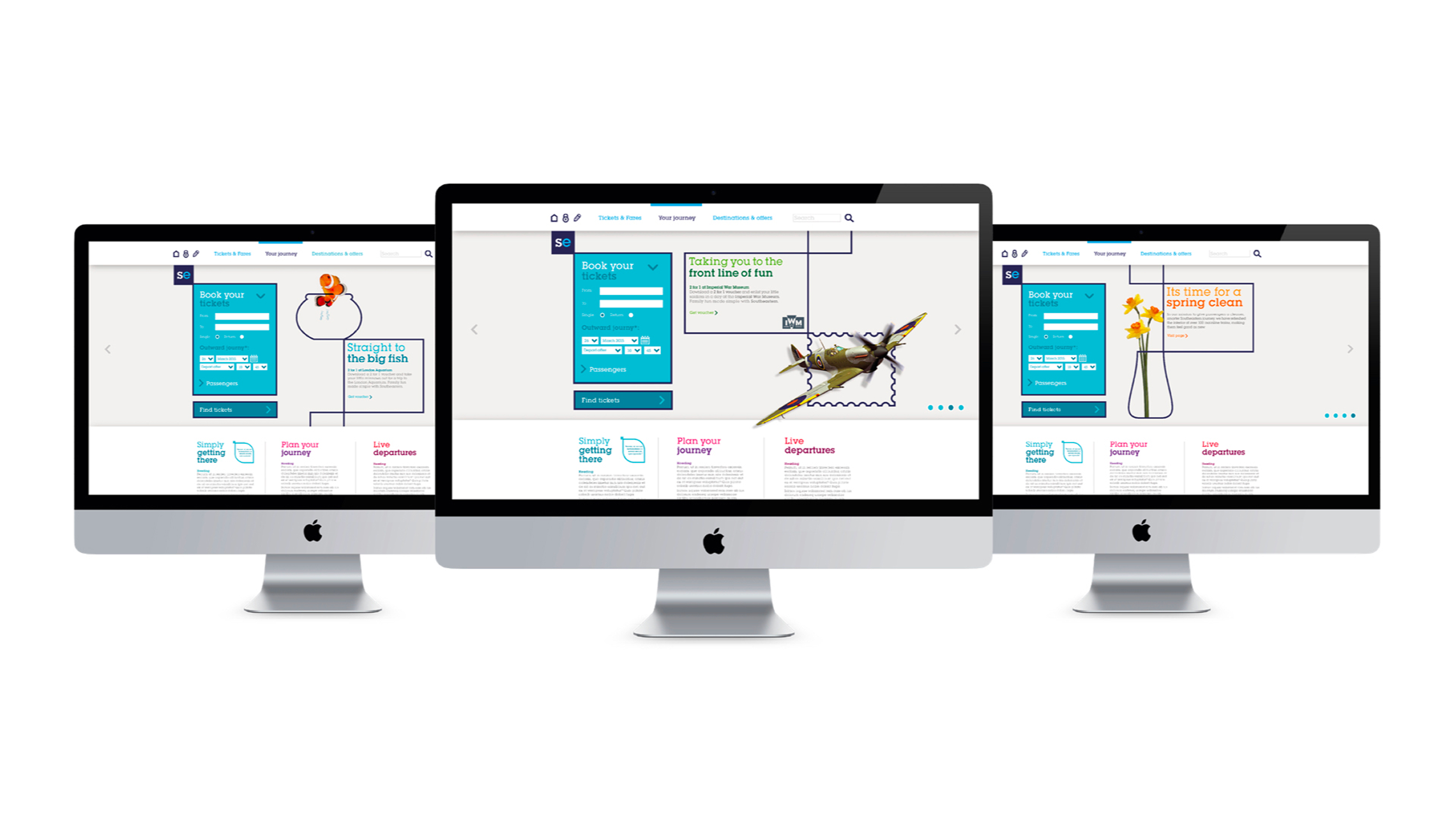
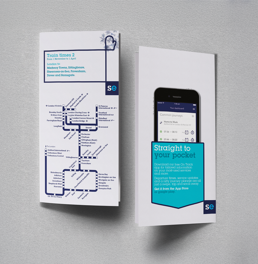
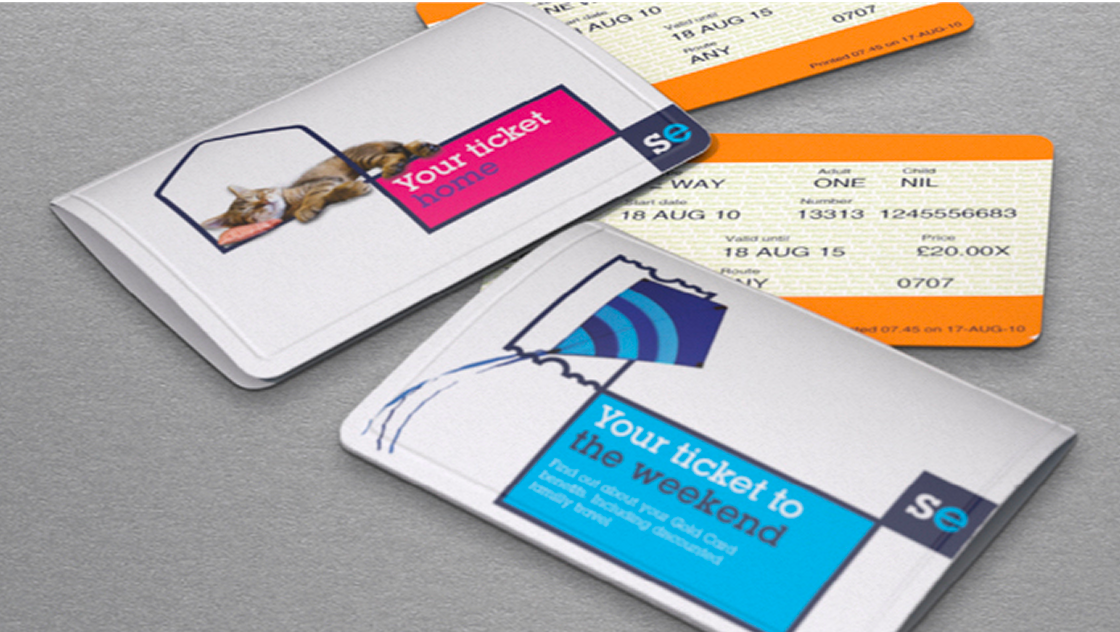
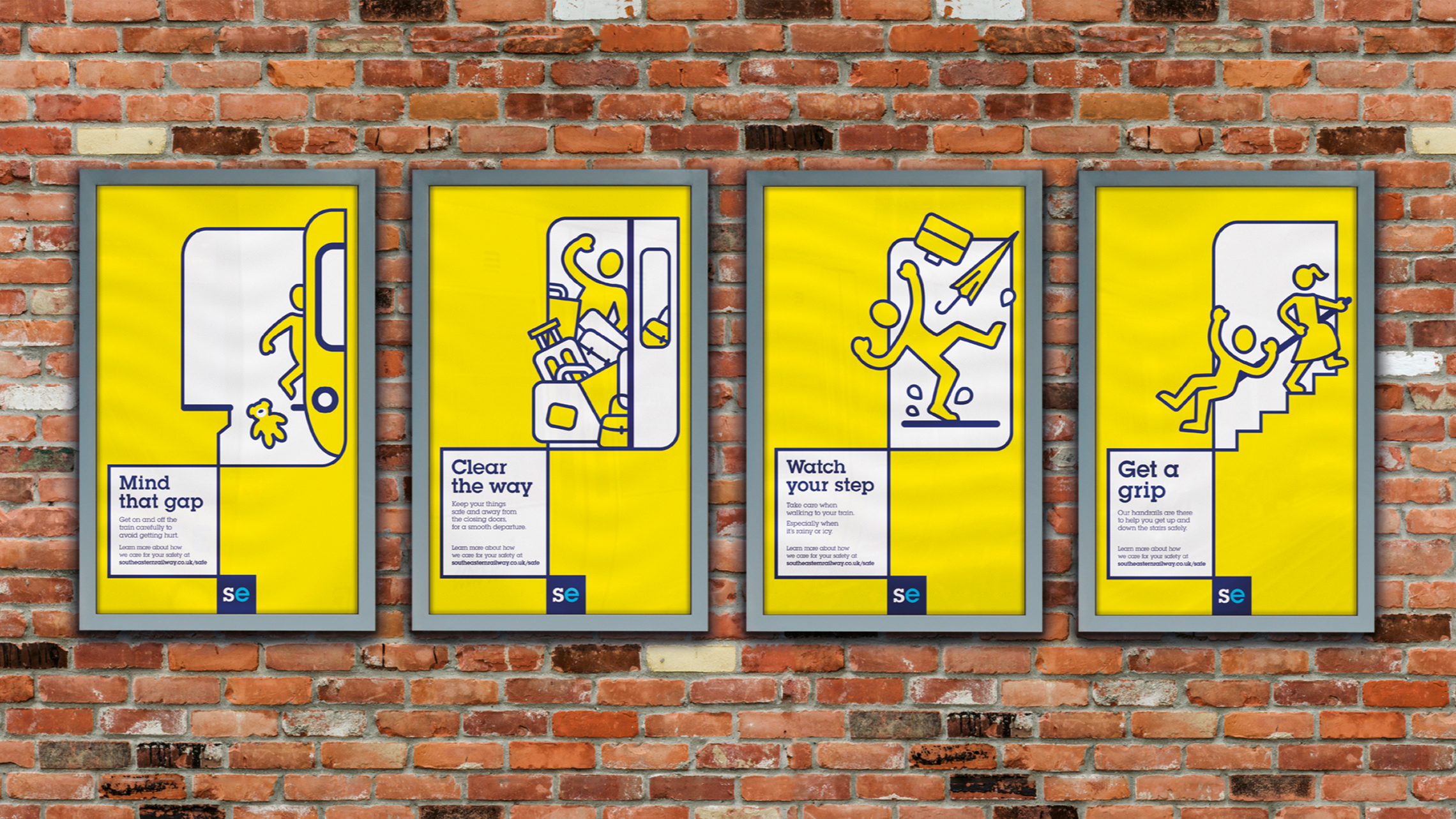
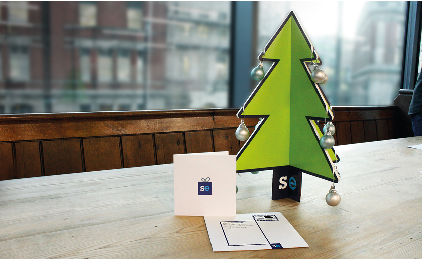
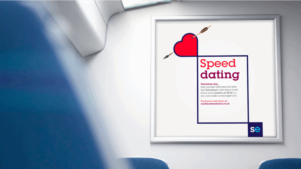
A new tone of voice was developed to be empathetic, open and determined. Visually, a modular system was built around a shorthand logo and a two-part framework: the clarity box for straightforward travel information, and the humanity box for engaging imagery and storytelling.
The staff reported a restored pride with a customers willingness to engage with branded uniforms and signage again, marking a big cultural shift for Southeastern.
Client: Southeastern Rail Project: Rebrand Agency: Elmwood Role: Creative Lead
A New Icon
In today’s fast-paced world, simplifying the wordmark into a clear graphic symbol, helped customers recognise and connect with the brand more effortlessly.
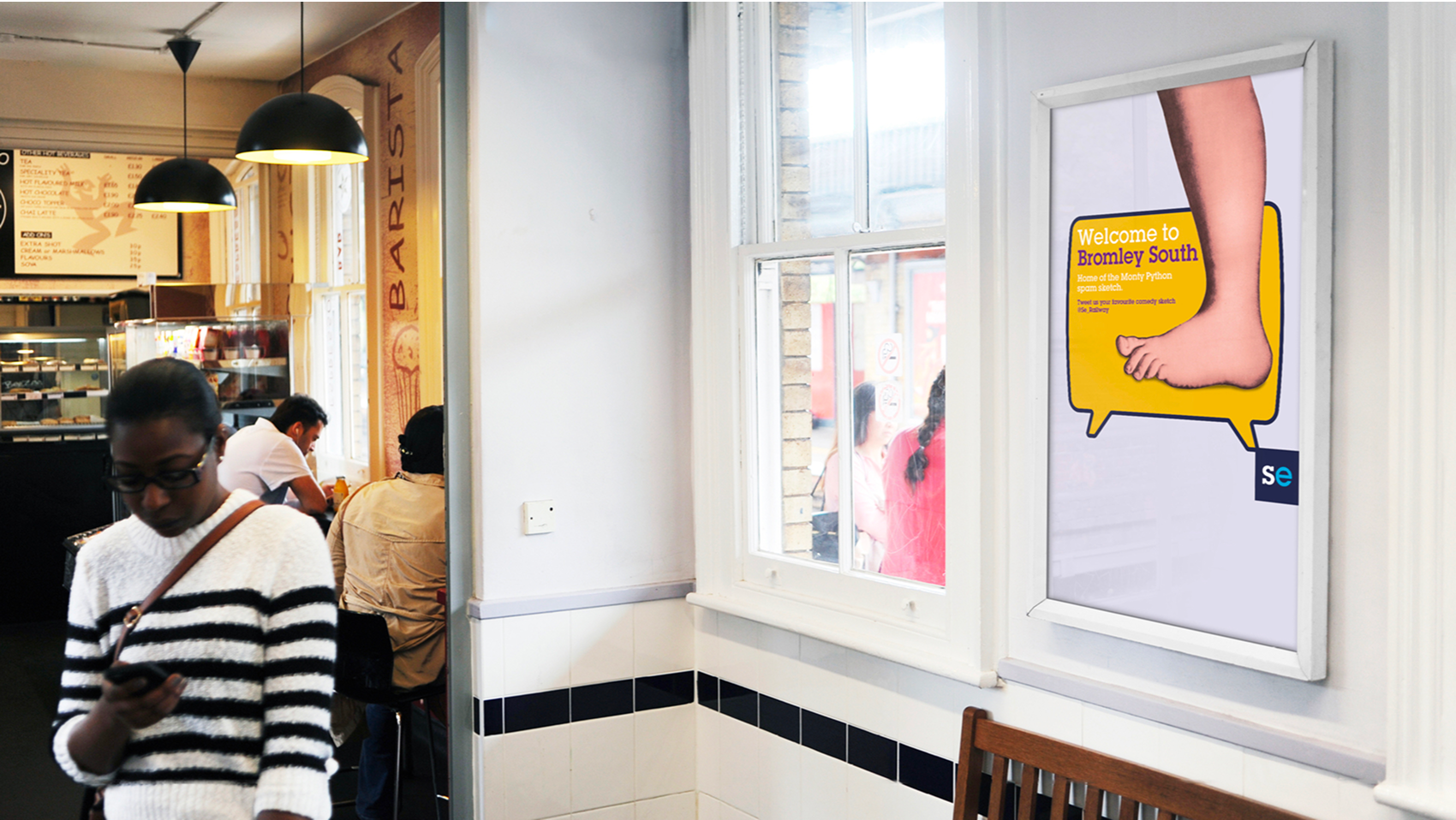
Connecting the brand to the local community via local knowledge facts about each station.
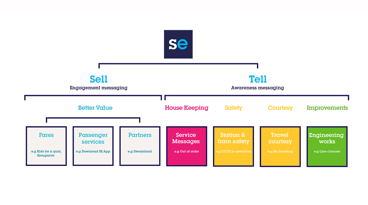
Communication Framework
The brand flexes in look and voice, adapting seamlessly to different situations while staying true to it’s core principles.