Rightmove was facing growing competition and a fragmented brand experience across employees, customers and business partners. The challenge was to create a coherent identity that worked seamlessly across every channel, online and offline.
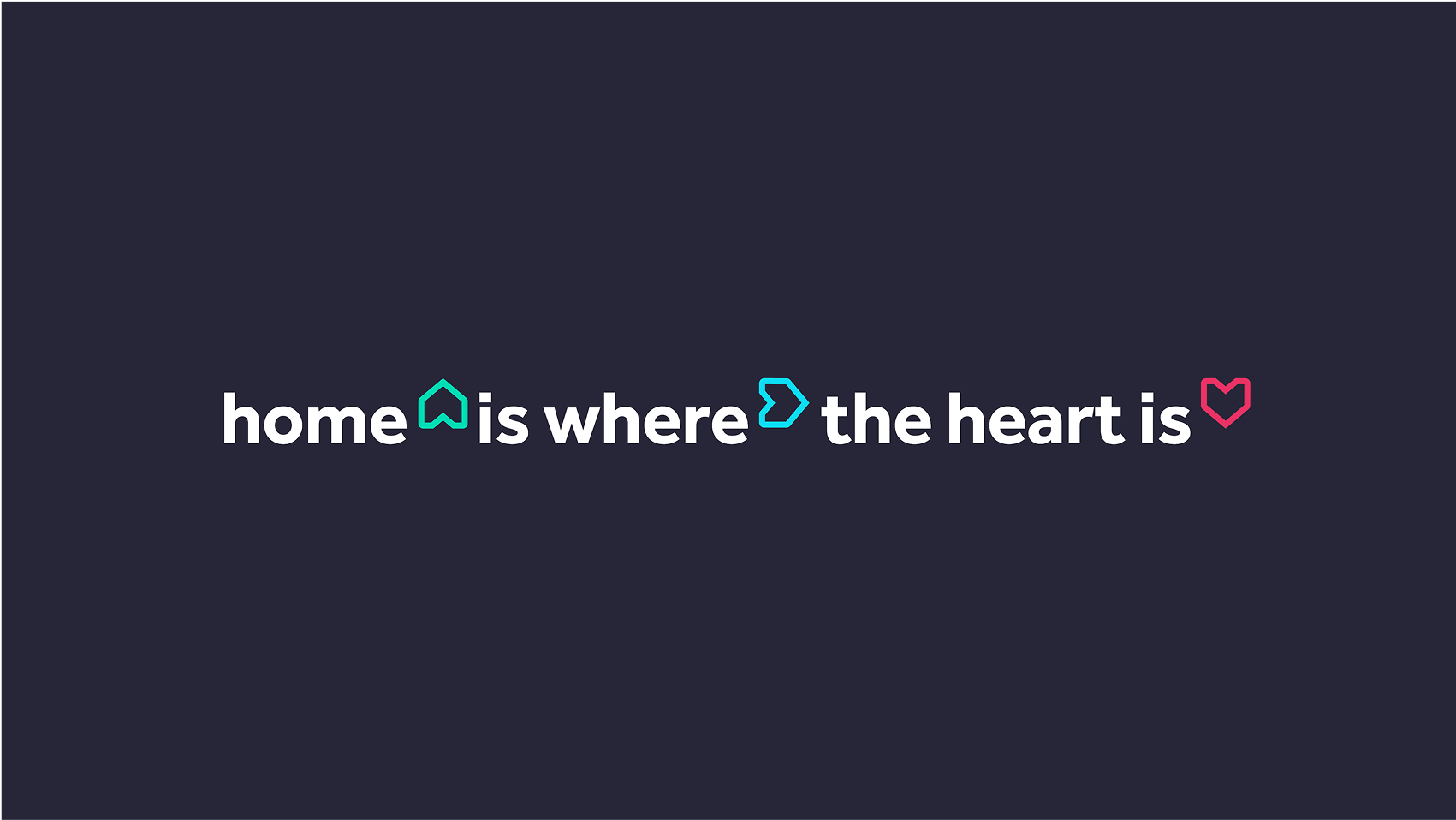
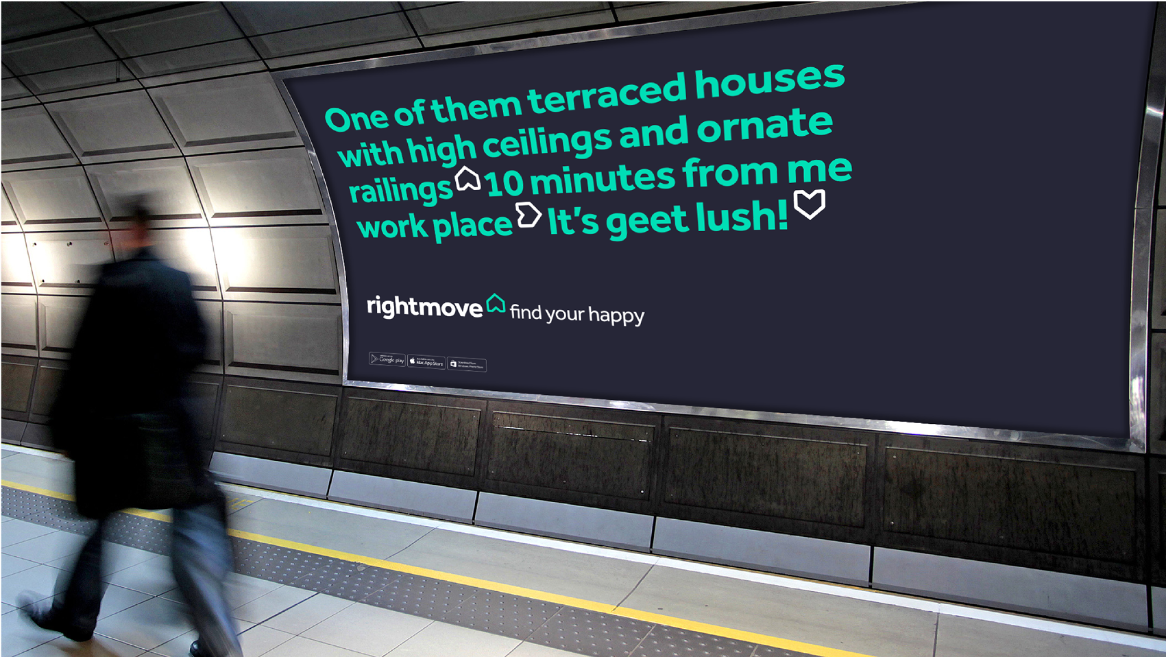
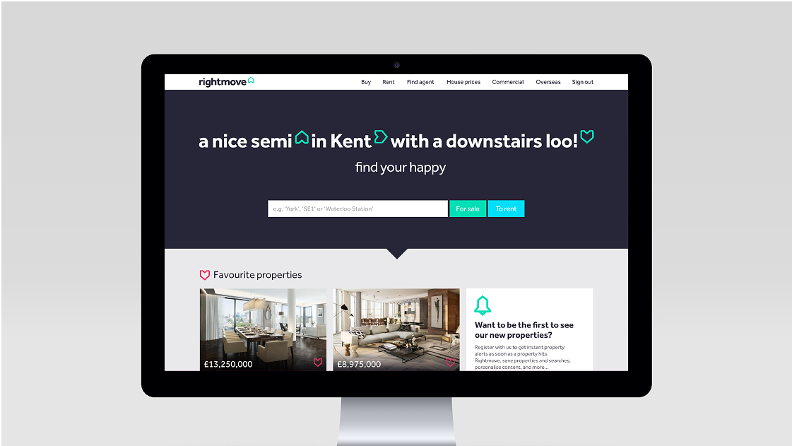
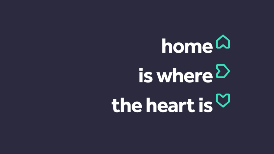
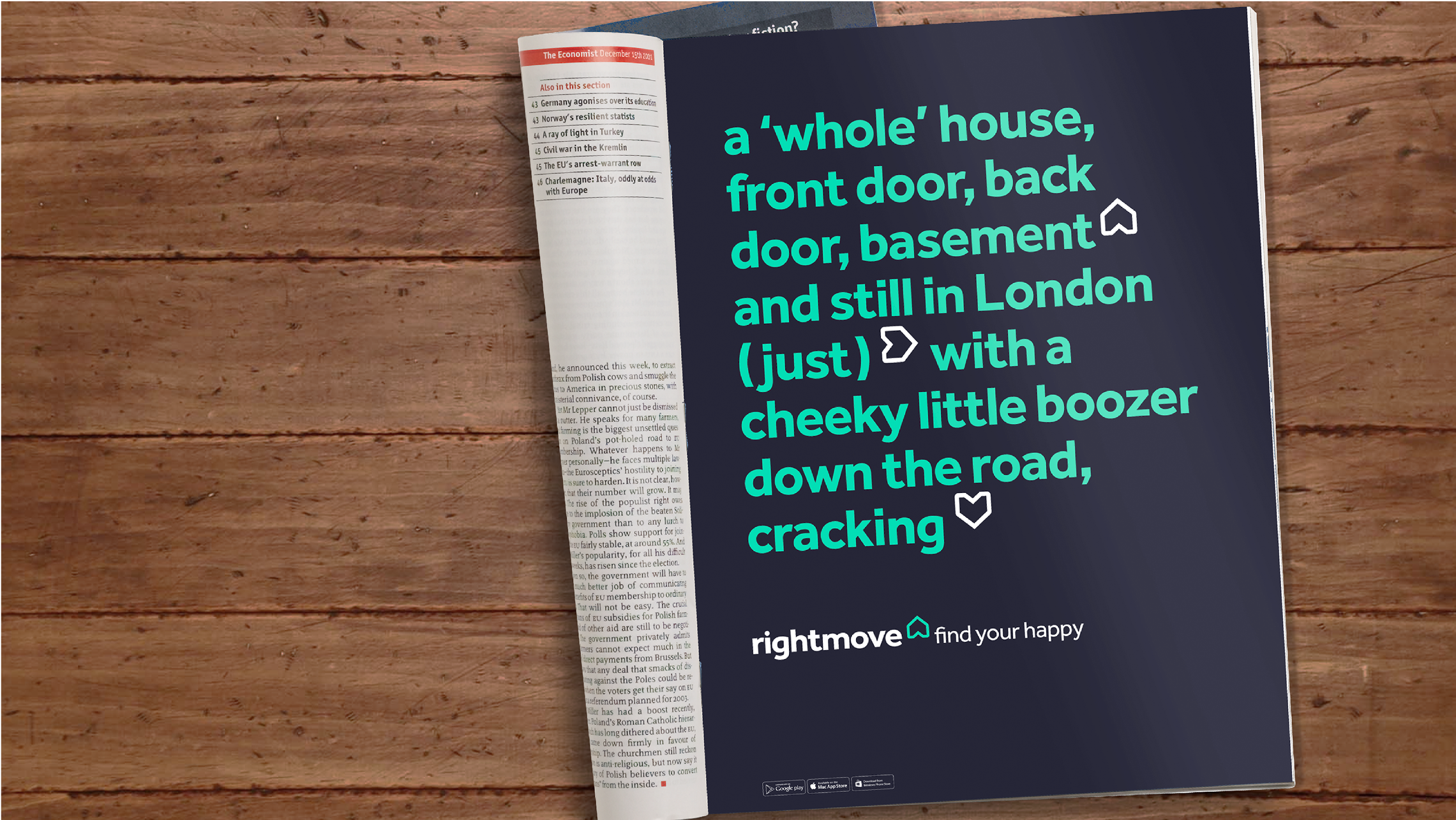
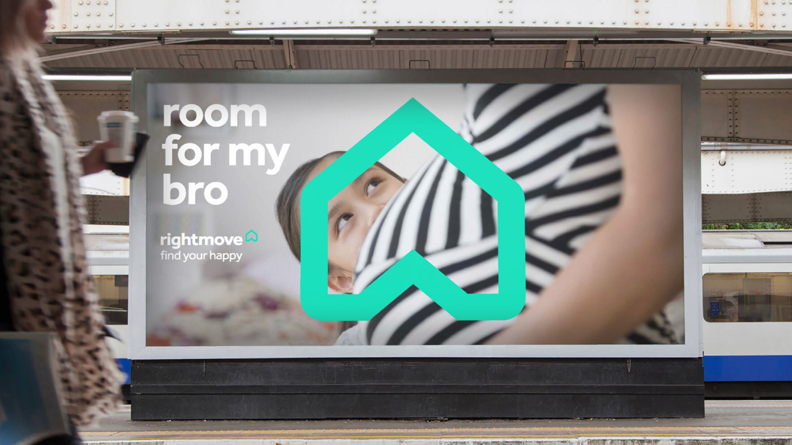
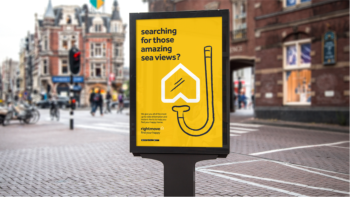
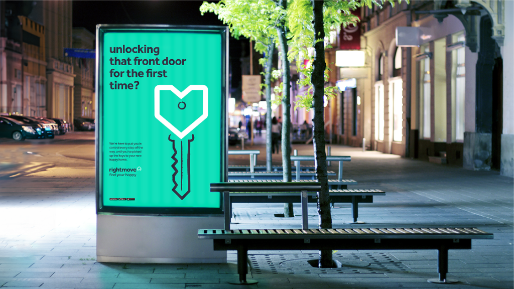
At the heart of the brand was a simple truth: in the UK, home is central to our happiness. Rightmove’s purpose: To Help People Find Their Happy, became the foundation of the new identity.
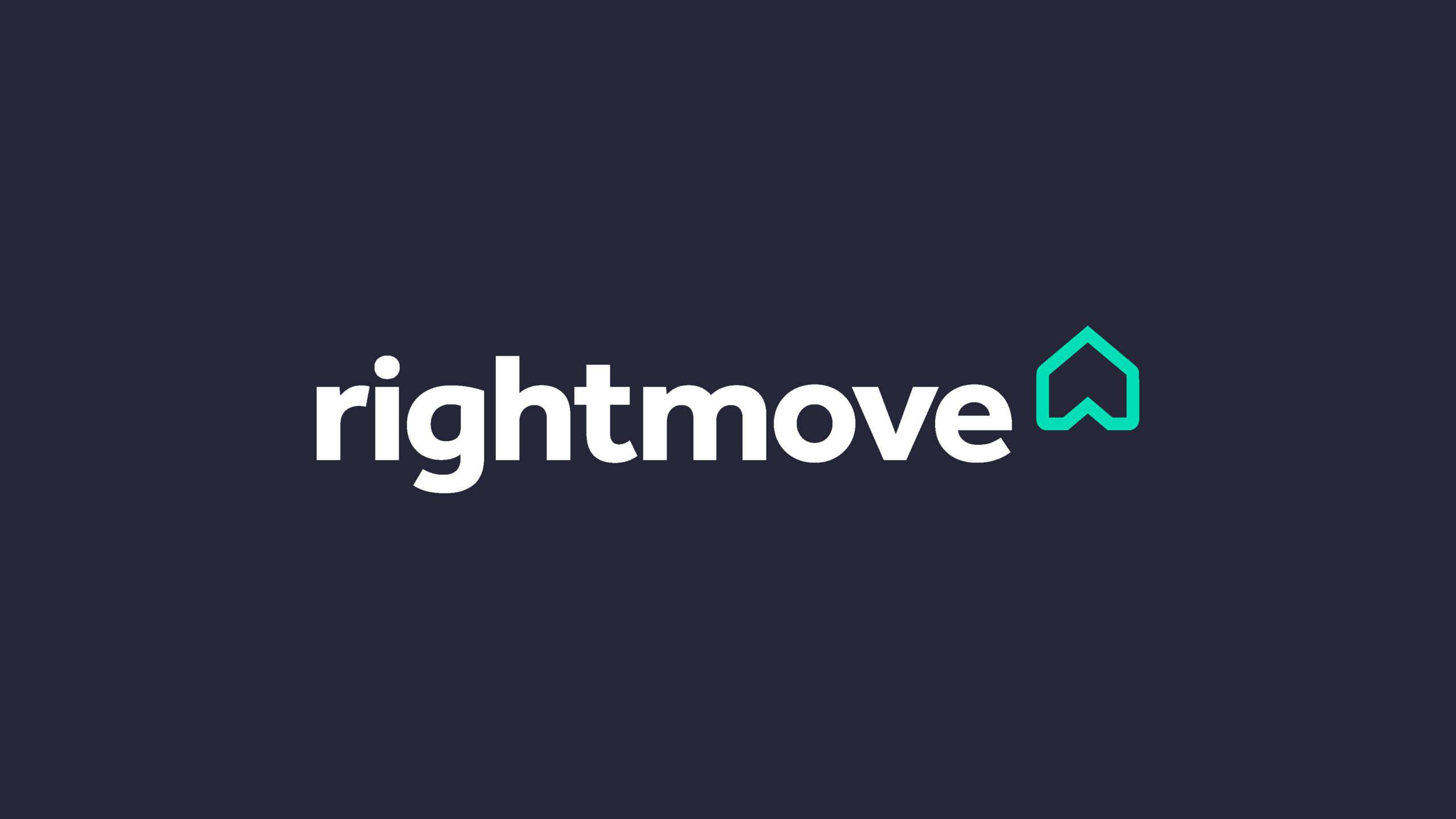
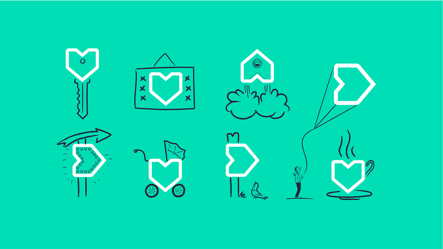
Inspired by the saying ’Home is Where The Heart Is, the refreshed logo was designed to rotate, shifting from a home, to an arrow, to a heart with each turn, visually telling the story of finding a happy. This evolved into a flexible copy platform that tapped into local dialects and expressions of happiness.
A bright, optimistic colour palette, a distinctive typeface, warm photography and playful doodles added character and charm. Together they created a connected, human brand experience that brought Rightmove’s purpose to life across every touchpoint.
Client: Rightmove Project: Rebrand Agency: The Team Role: FL Creative Lead
Wordmark
Chris Boardman is right at the heart of everything the brand does, is and creates. While not taking centre stage, he is an integral part of the structure and the integrity of the company and its output. This is why we placed C within the B.
A new icon
The new B icon inspired by a peloton formation of riders, riding out together.