GlaxoSmithKline a global pharmaceutical and consumer health giant, separated into two stand-alone businesses in 2022, with the consumer health side of the business requiring a new visual identity.
With 22,000 employees across 70+ countries and brands like Sensodyne, Voltaren, Panadol and Centrum, the launch was a chance to change how billions engage with everyday health.
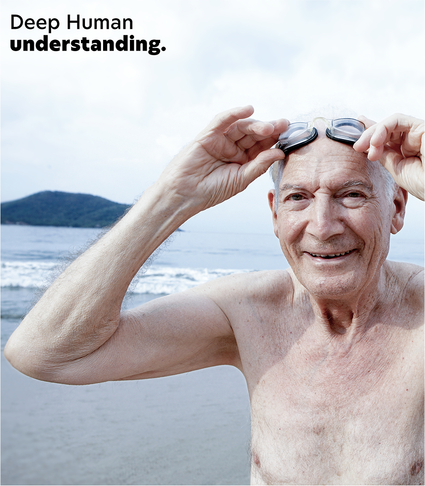
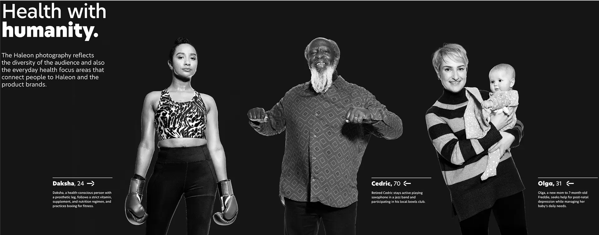
Healthcare is noisy and confusing, with tech giants competing for attention while health systems face strain. There was an opportunity to bring more humanity to the sector and make everyday health simpler, clearer and more inclusive.
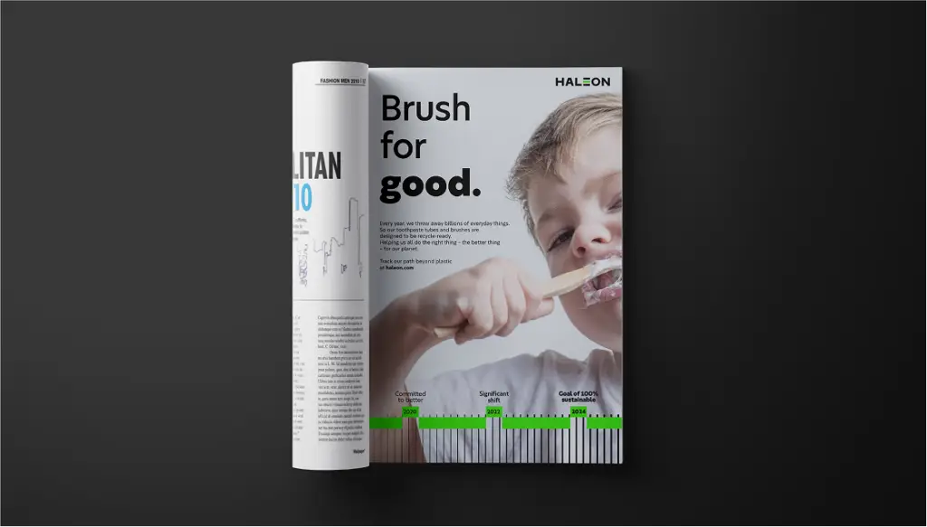
Haleon became the new name for the business, blending hale – an Old English word for good health – with leon, a symbol of strength. The result is a name that feels strong, optimistic and human, designed to connect with people everywhere.
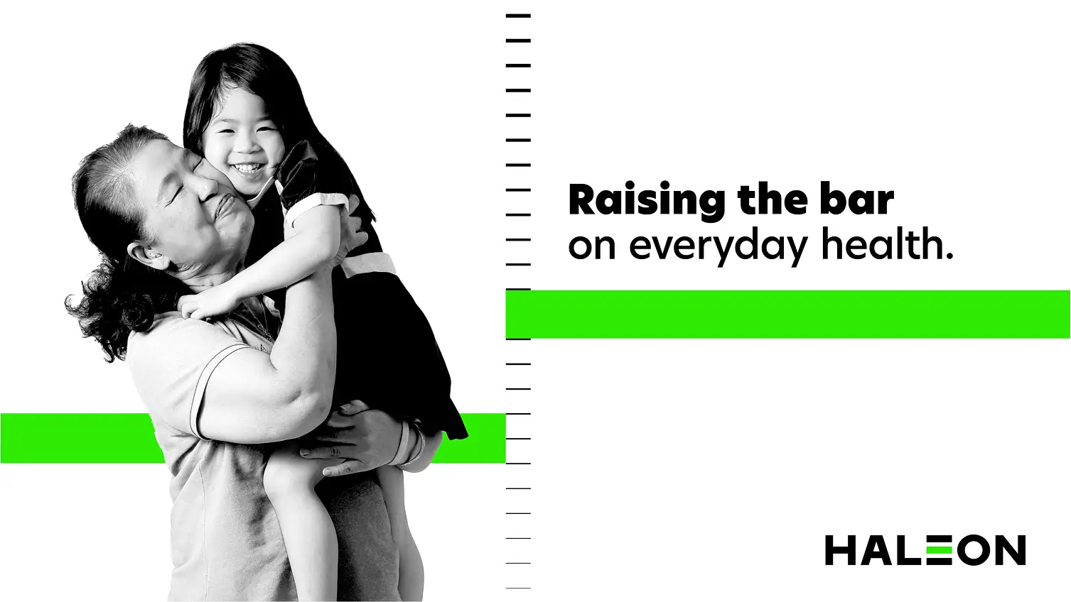
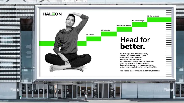
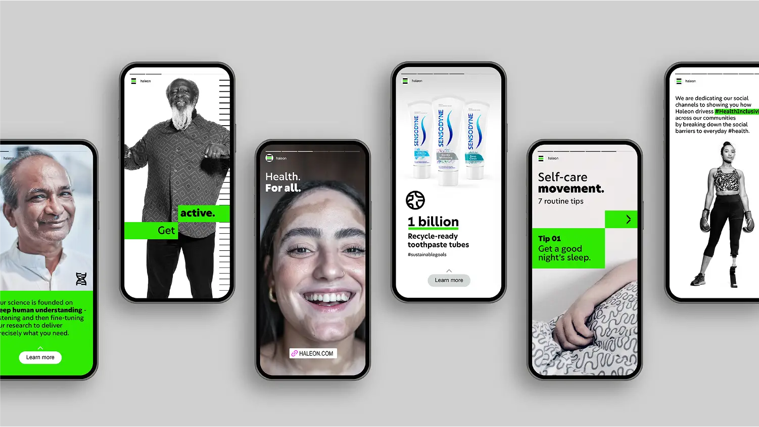
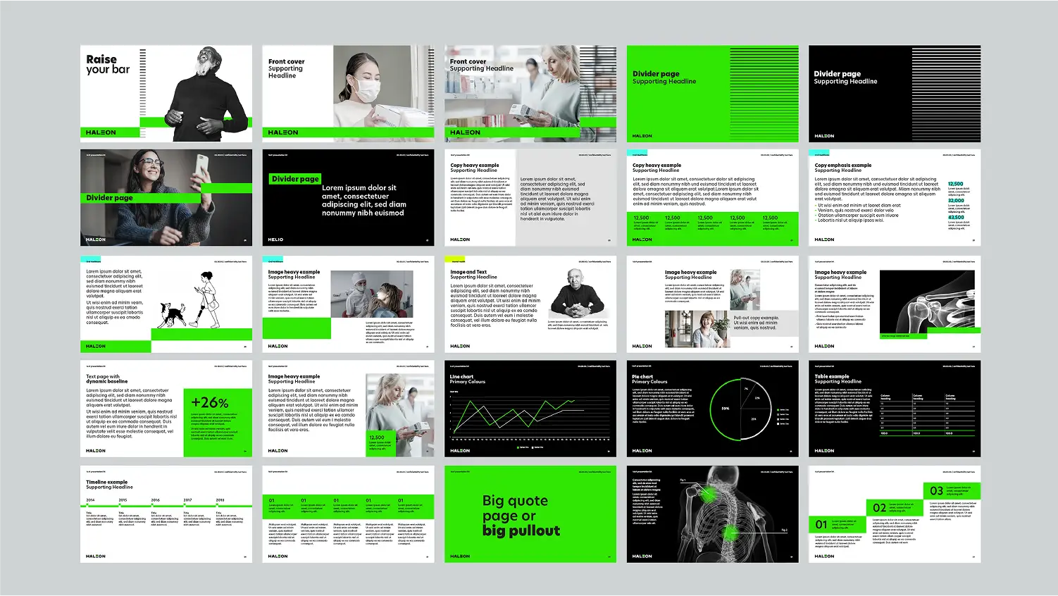
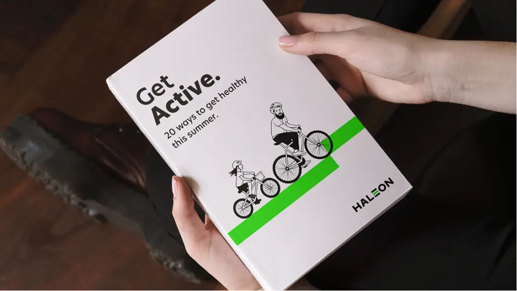
The creative idea for the new identity was to Raise the Bar on everyday health. A stripped-back, modern visual language and a straight-talking tone of voice. Built from a new company purpose: To deliver better everyday health with humanity.
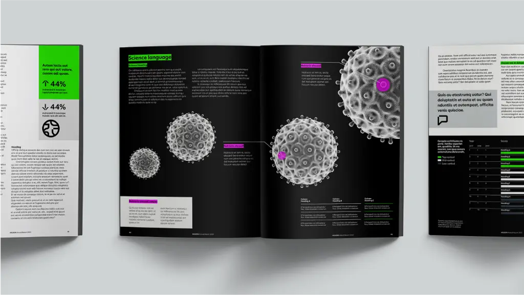
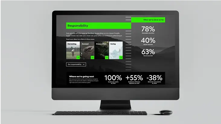
The design system uses two core graphics – the baseline and metric – to measure progress and unify communications. A clean black-and-white palette, lifted with Haleon Green, cutting through clutter. Real people and real stories bring optimism and empathy, creating a brand that feels both motivating and human.
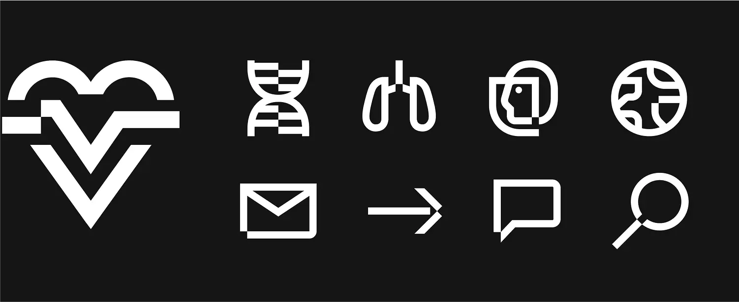
Each icon is designed with a distinctive visual shift – a segment nudged into a new position – echoes the positive, progressive shift of the Baseline hero graphic.