A.T. Kearney is one of the world’s leading consultancies, with 3,600 people in 40 countries and clients including over three-quarters of the Fortune Global 500. Yet despite its scale and heritage, the brand lacked recognition and a clear story about who it was and why it mattered.
Clients told us what set Kearney apart was its personal, practical approach. Refreshingly different in a sector often seen as elitist and arrogant. We saw an opportunity to build a brand that reflected this humanity and made its people the heroes.
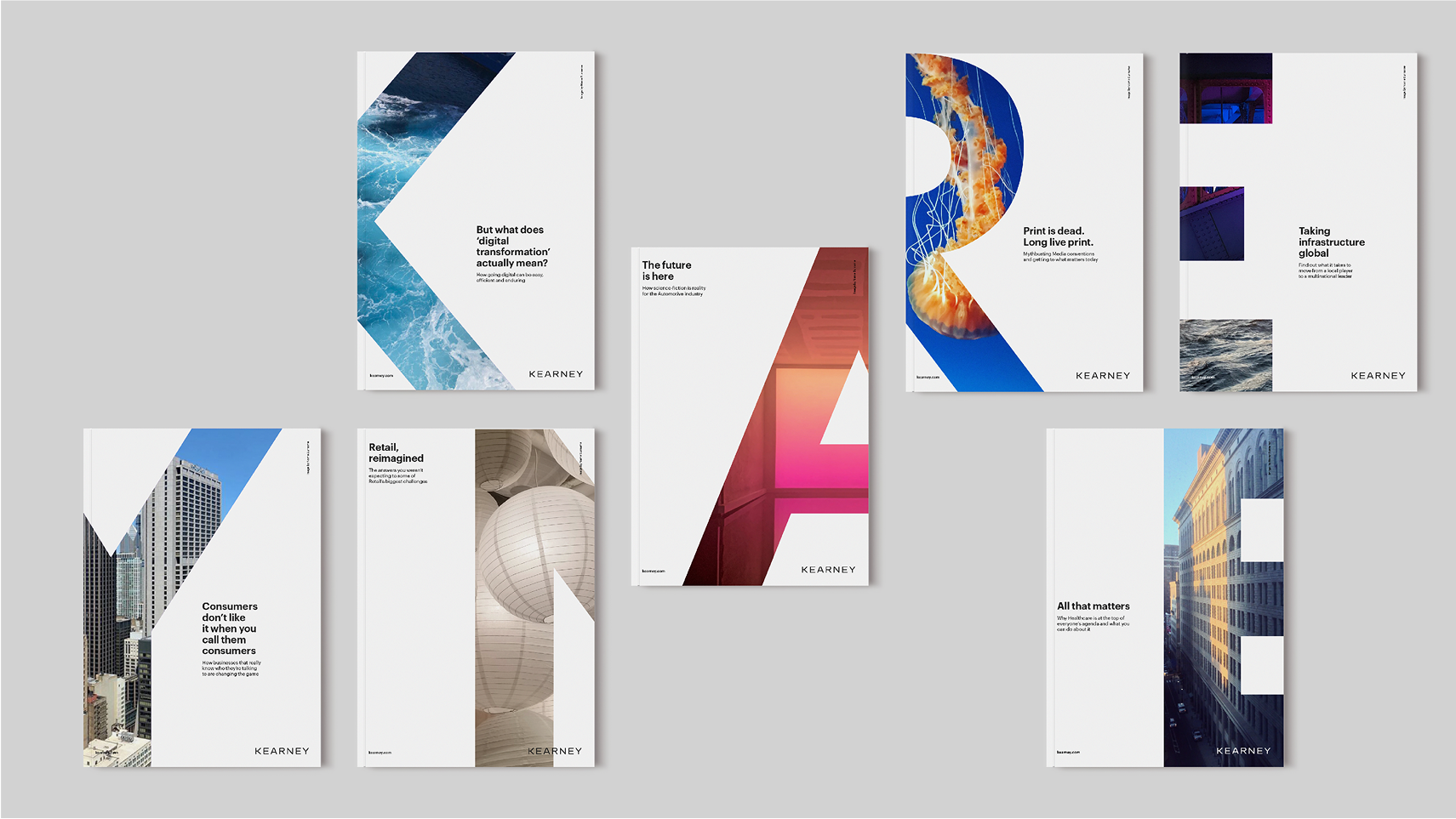
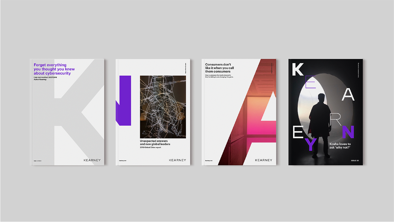
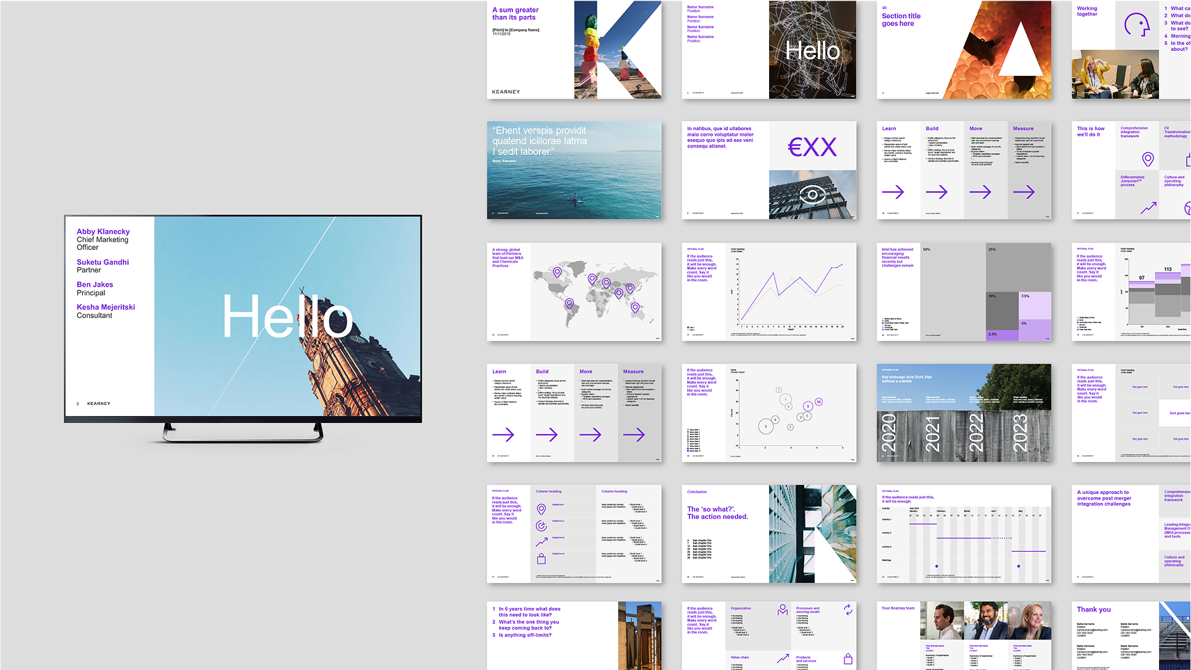
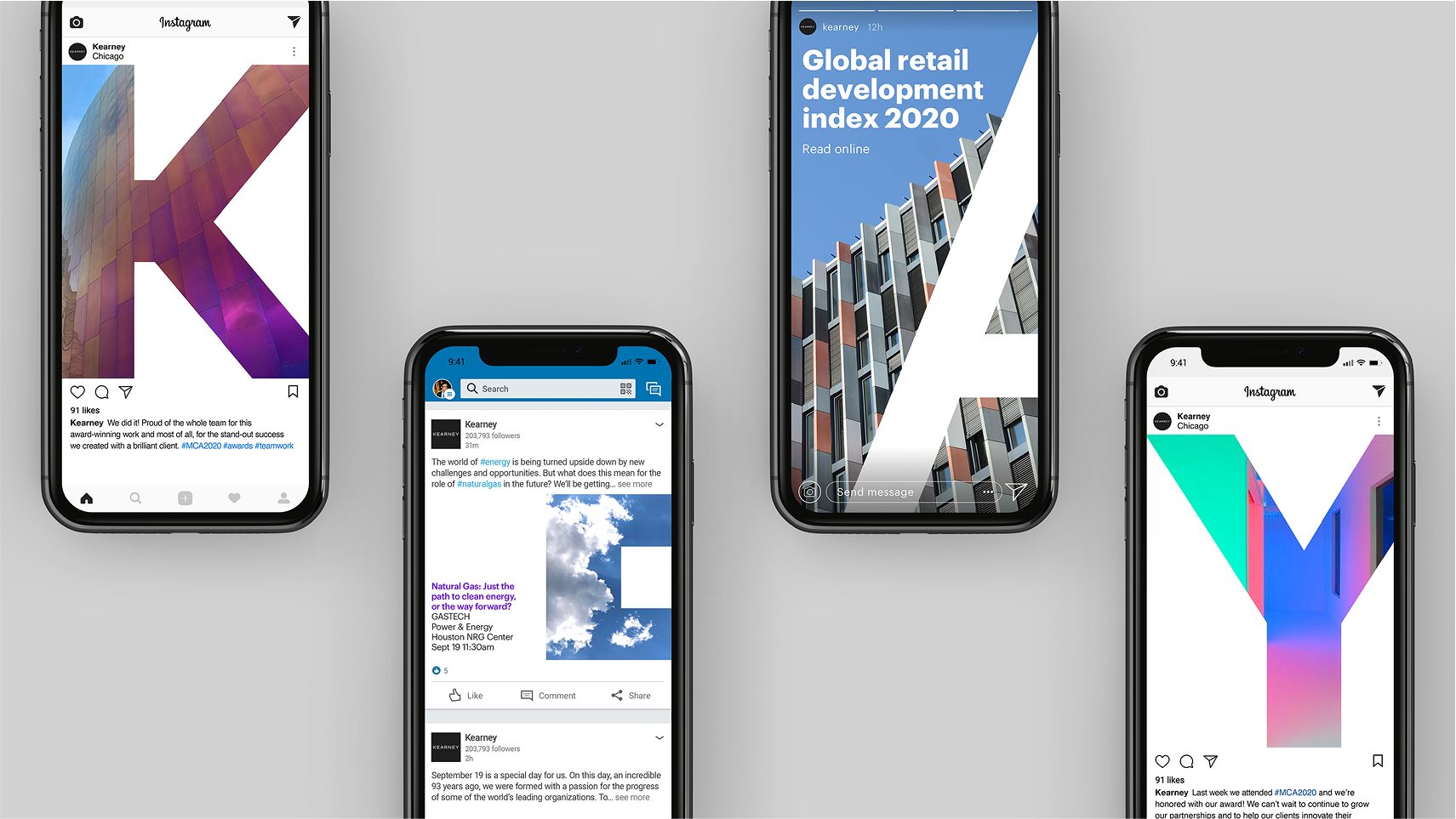
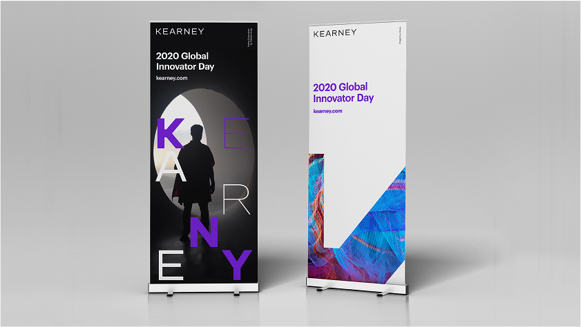
The idea was to shift focus from one founder to the many characters that make up Kearney. By dropping the initials, the new name celebrated the collective strength of its people. A fresh design system ‘captured the character within the characters,’ with the logotype becoming a framework for crowdsourced employee photography.
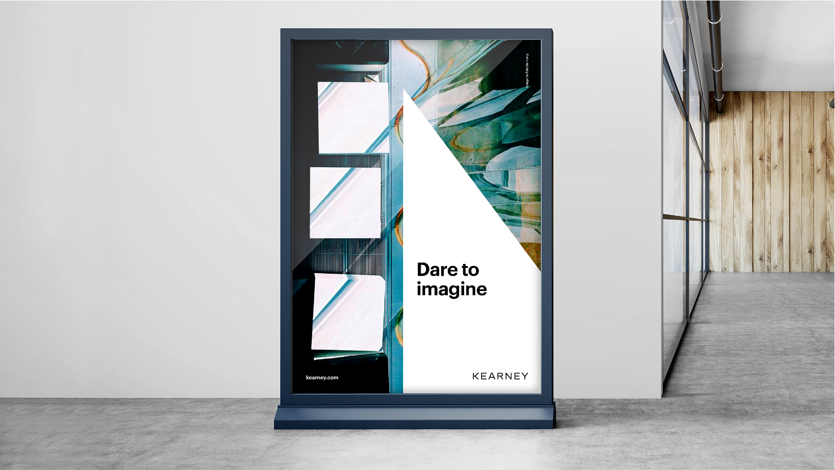
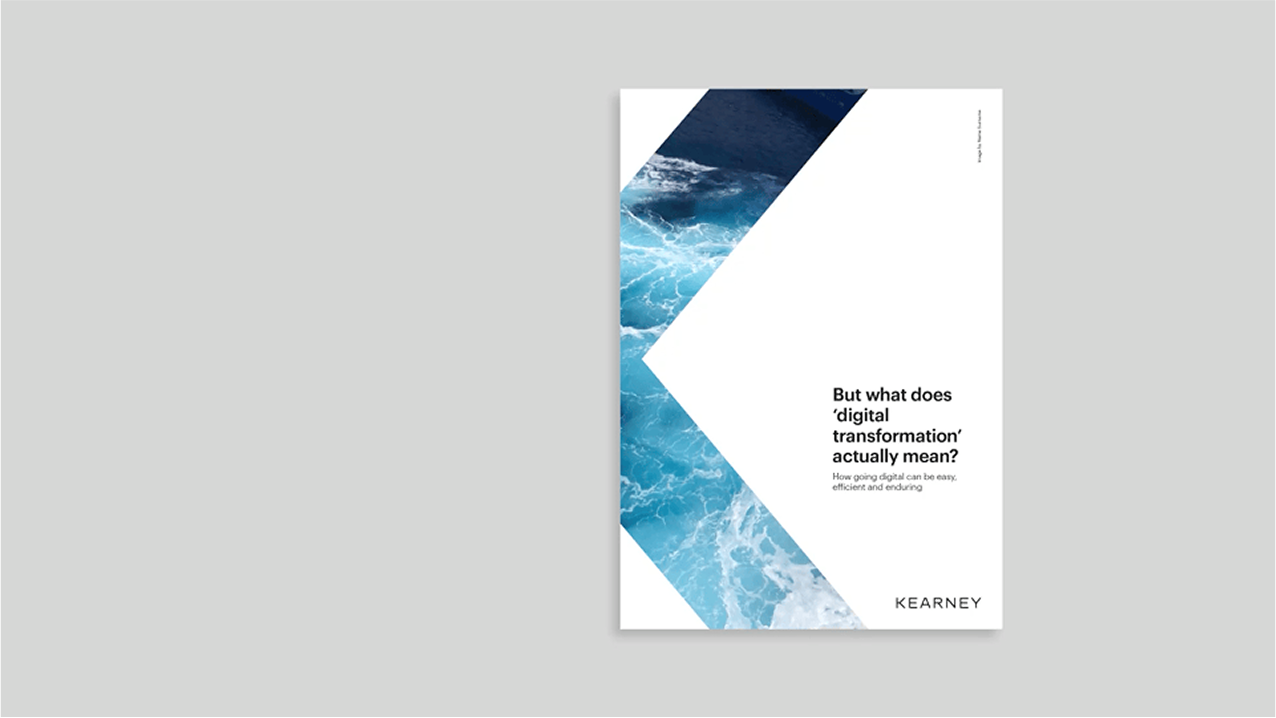
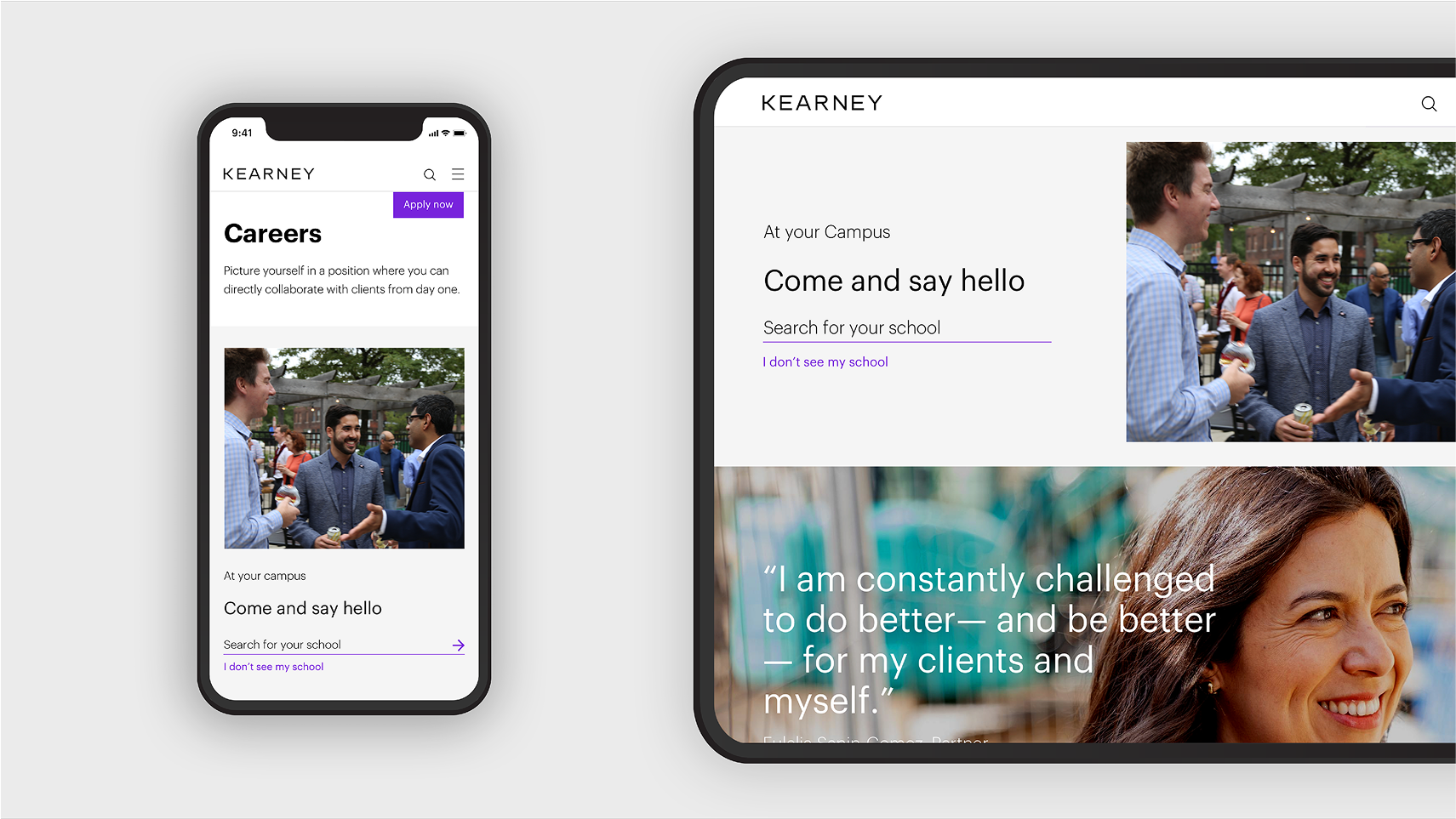
Stock images were eliminated, replaced with authentic photos taken by staff. Combined with a timeless black-and-white palette and a highlight of purple, the result is a confident, distinctive identity that feels both relatable and human.
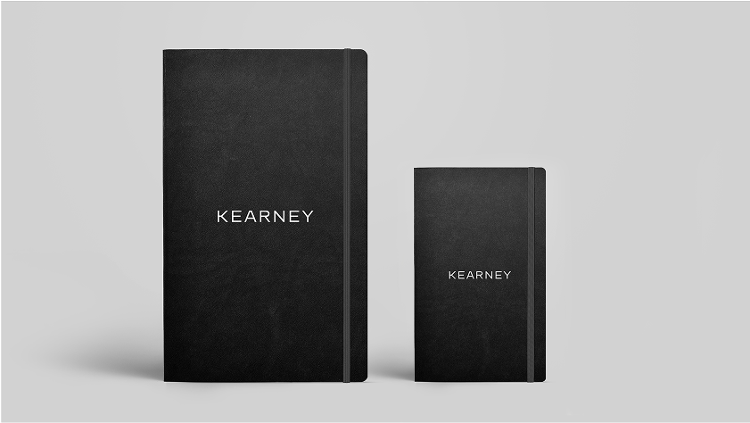
Client: Kearney Project: Rebrand Agency: Siegel + Gale Role: Creative Lead
Capturing the character
within the characters
People can snap, upload and tag original shots through a simple, user-friendly app on their smartphone.
Employees are front and center in the entire brand experience. Their points of view, actions and ideas drive a one-of-a-kind image library.
Every image used in the brand’s marketing, communication and client presentations is taken by a Kearney employee.