Chris Boardman is a legendary figure in British cycling, celebrated for his three world hour records, multiple stints in the Tour de France yellow jersey, and an Olympic gold medallist.
He was known in the cycling world for his meticulous attention to detail, earning him the nickname “The Professor”. Retiring from professional racing, Chris established Boardman Bikes, building upon his meticulous approach by introducing serious innovation to the professional world of cycling.
After massive growth, Boardman Bikes needed to enhance its credentials and grow its brand awareness among novice and expert riders. The original brand was created around Chris and his previous achievements with the original logo stylised as “cboardman” and the brand’s hero colour (Yellow) from Chris’ winning jersey. However, the Boardman team had also grown larger, sharing the same passion for riding with wider sense of togetherness in life.
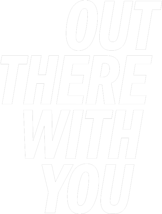
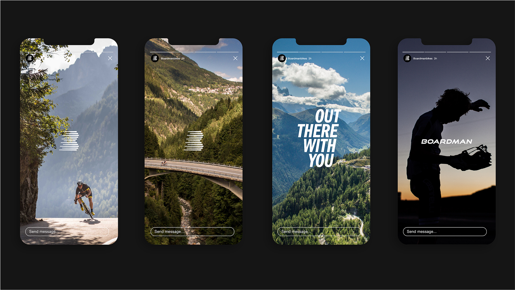
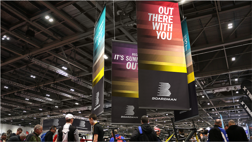
The new visual identity was created around the creative idea and strapline ‘out there with you’. A reassuring presence that you are not just buying a bike, you’re joining a team working together.
The new B icon for the brand, which visually represented a peloton of riders, riding out together and a bolder wordmark with a hidden letter “C” in the negative space within the “B” of “Boardman”. This was to reflect Chris’s integral role within the brand, without taking centre stage.
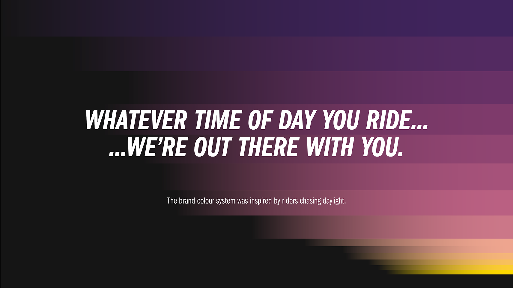
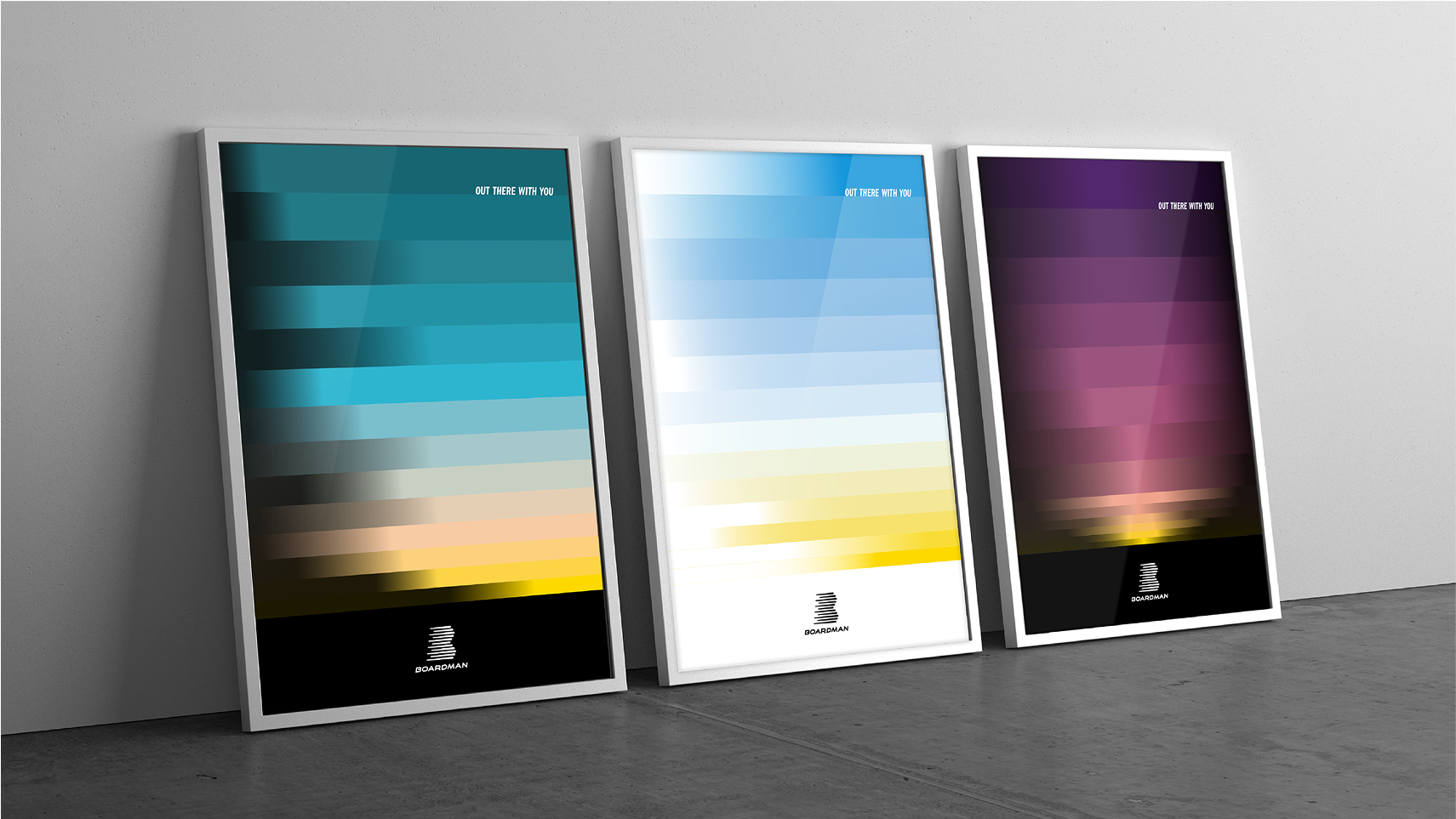
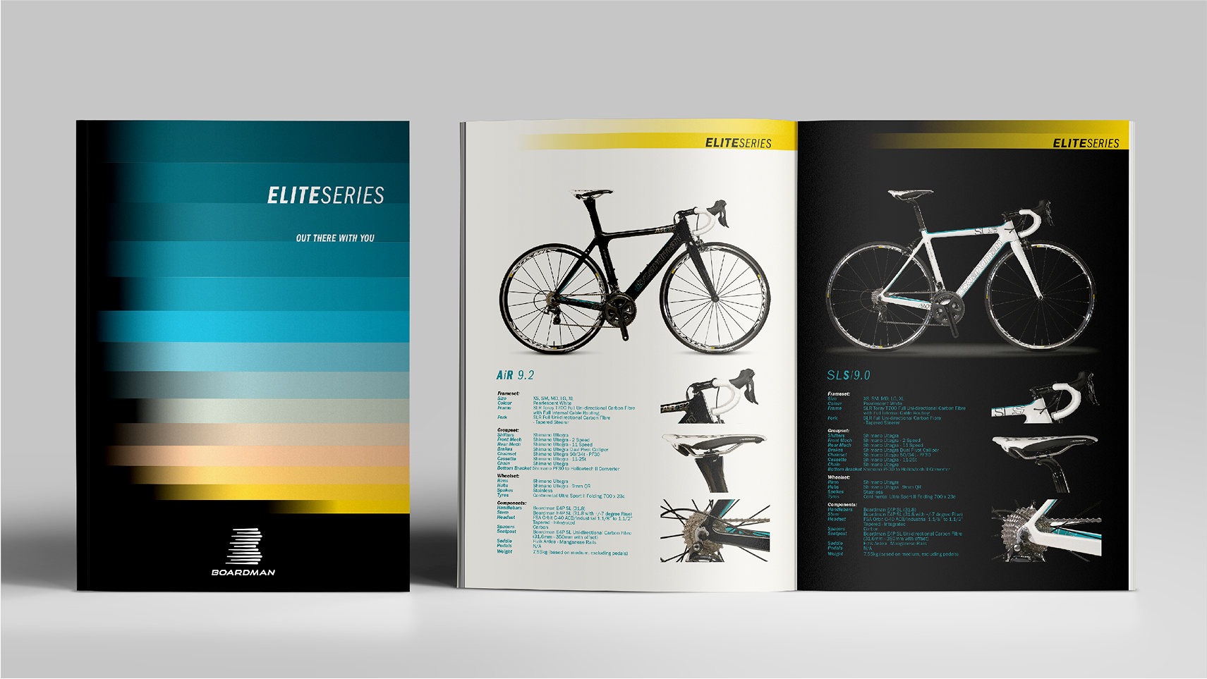
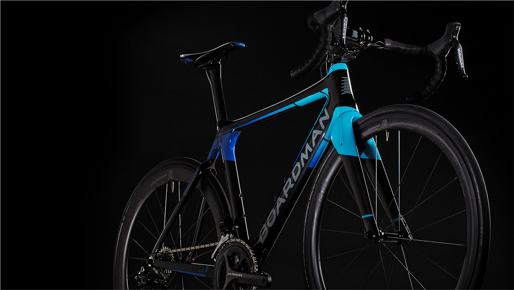
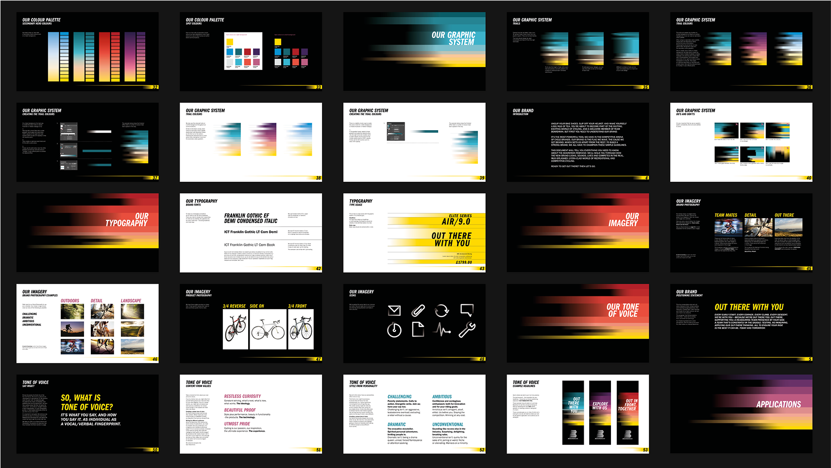
The brand colour palette and design system was built upon the creative idea ‘Whatever time of day you ride’…’We’re out there with you’ giving more meaning to the brand colour yellow and accompanying it with a new spectrum of brand colours representing daylight.
Client: Boardman Bikes Project: Rebrand Agency: Elmwood Role: Creative Lead
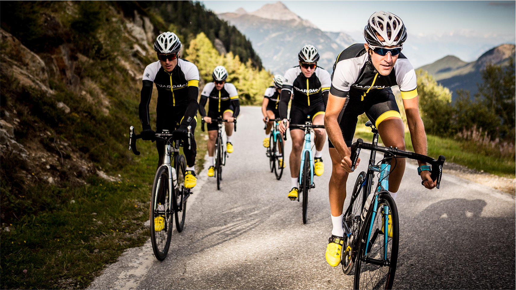
Every early start.
Every pothole, every puddle.
Every impossible incline.
We’re with you – because we’re out there too.
Out there, supporting you; a reassuring team presence by your side.
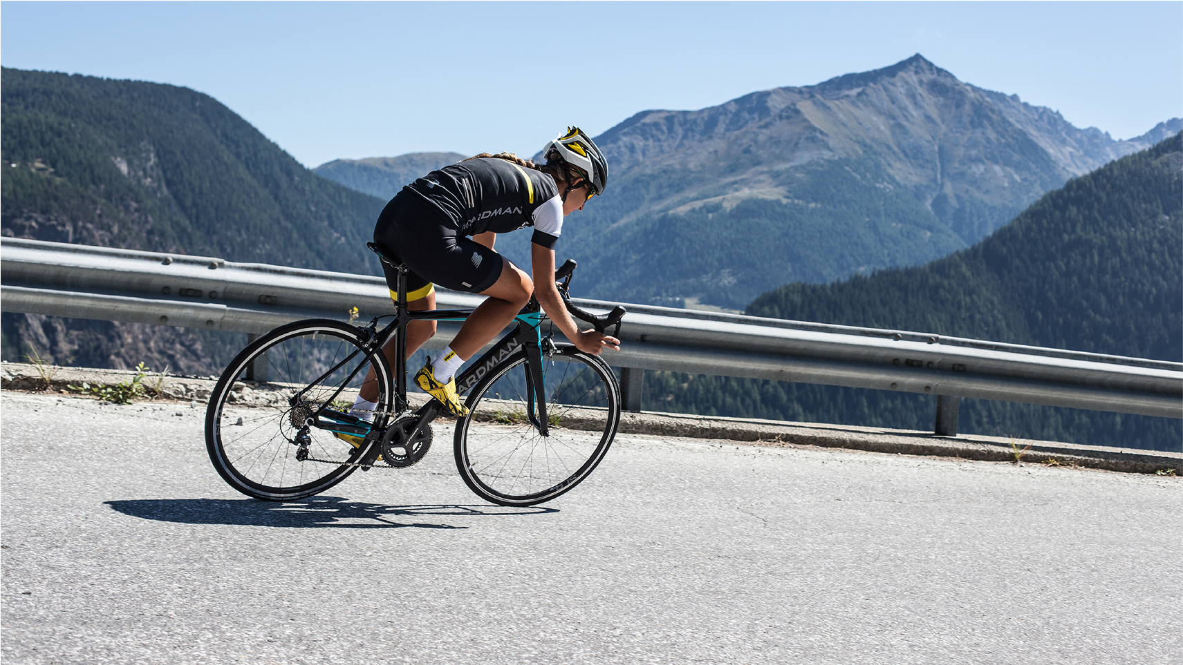
A team that’s constantly in the saddle:
testing, reimagining, applying our out-there thinking.
All to ensure your ride is the best it can be, today and tomorrow.
A new icon
The new B icon inspired by a peloton formation of riders, riding out together.
Wordmark
Chris Boardman is right at the heart of everything the brand does, is and creates. While not taking centre stage, he is an integral part of the structure and the integrity of the company and its output. This is why we placed C within the B.
Colour system
The brand colour palette and system was inspired by riders chasing down the daylight. Whatever time of day you ride…we’re out there with you.